
The one thing your team needs to agree on before prompting any AI tool
Have you seen that meme with the guy pointing at a wall covered in papers, pictures, and strings and conspiracy theories? That was me when ChatGPT came out, pointing at a screen saying “it’s just clusters and vectors, it’s not magic.” Nobody cared. Yet.

Back in 2020 I was working at a startup that collected, processed, augmented and delivered insights about points of interest, physical locations and all the data you can attach to them. My role at that point was somewhere between designer, PM, analyst, and person trying to survive a pandemic at a small but successful startup. Our CTO knew we had to get more technical to stay competitive, so he brought in a data scientist and pushed us all to engage with the work seriously. There was a lot of math, a Python library called pandas that I still can’t fully explain, and diagrams I stared at longer than I’d like to admit.
Then he sent us a paper. I still think about that abstract, which is corny but true. It was called “Attention Is All You Need,” published in 2017 by a team of researchers at Google, and I’d argue it’s one of the most consequential things written in the last decade. The architecture it introduced, the transformer, is the foundation underneath every large language model you’ve used.
What made it click for me wasn’t the math. It was the concept. Before this, AI processed information sequentially, word by word, often losing the thread by the time it reached the end of a sentence. The attention mechanism changed that. It let the model look at everything at once and learn what to focus on, what to weight heavily, what to set aside. The model developed something that looks a lot like judgment about relevance.
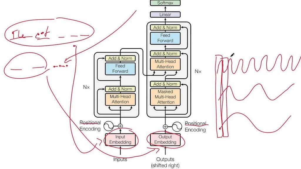
So if attention is how the model decides what matters, vectors and clusters are where it actually puts that attention. Think of it this way: instead of storing words as definitions, the model represents them as points in space. Words with related meanings end up close together. Clusters form. “Invoice,” “payment,” and “receipt” live near each other. “Dashboard,” “metric,” and “report” form their own neighborhood. Meaning lives in the relationships, not in the words themselves. Which means if your team calls the same thing three different names, the model isn’t confused because it’s dumb. It’s confused because you are.

The real reason your AI keeps getting it wrong
As designers we wear a lot of hats. The one that matters most right now isn’t UI, or systems, or even UX. It’s language.
This past week I was presenting analytics to a client and he stopped me mid-sentence: “what does intent mean, what does it mean to you and your team, because I’m understanding it differently and I’m not sure the client even meant that.” Intent was the output of the LLM. Not necessarily wrong. We had just all been naming the same thing differently, and nobody had caught it until that moment. When it was just humans in the room, that was an awkward meeting. Now that AI is in the room too, it’s the kind of misalignment that ships.
The moment AI is in the loop, language gaps stop being a coordination issue and start being a product issue. The model doesn’t ask for clarification. It doesn’t flag ambiguity. It just acts on whatever definition it inferred, confidently, at scale.
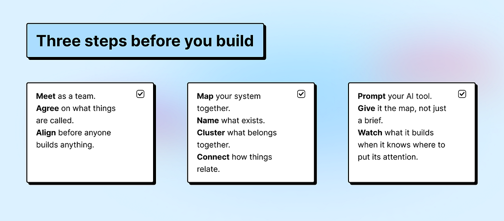
So what does it take to make sure the model is working from the same definitions as your team? That’s what a data model is for. The following is a practical guide to building one with your team, for whatever AI product you’re working on, so it makes sense to you, the AI, and ultimately the people you’re building for.
Before you build anything, name the things: entities
For the sake of this exercise, let’s start fresh. We’re building a food delivery app. Such an innovation, I know. FYI entity is any thing in your system that has a name, a definition, and attributes that describe it. The noun your whole team needs to agree on before anyone builds anything.
Before we list a single entity, we need to know what we’re trying to make someone feel. In this case: a hungry person orders food and it shows up. Fast, correct, no friction. That experience is the constraint. Everything we define has to serve it.

So let’s list what we actually need for that to work:
- User: the person ordering food, they have a location, preferences, and an order history.
- Restaurant: the place preparing the food, they have a menu, hours, and a location.
- Menu item: a specific dish or product a restaurant offers, it has a name, a price, and it belongs to a restaurant.
- Order: the transaction connecting a user to a restaurant, it has a status, a list of items, a total, and a timestamp.
- Driver: the person delivering the order, they have a location, availability, and an assigned order.
- Delivery: the physical act of getting the order from restaurant to user, it has a route, a status, and an estimated time.
- Payment: the financial record of the transaction, it belongs to an order and has a status.
- Review: feedback left by the user after the delivery, it references the order, the restaurant, and sometimes the driver.
Those are entities. Defined, named, one sentence each. That’s step one.
You probably already work with a version of this and don’t call it that. Designers will recognize it as an entity relationship diagram, a tool for mapping how concepts connect. PMs have fragments of it scattered across acceptance criteria and data requirements in tickets. This isn’t a new idea. Engineers have been doing this for decades, and have been asking for this shared language for a while. Three versions of the same map, rarely shared.
What’s changed is that AI made it everyone’s problem. When a model has to reason over your product, vague definitions don’t just slow down a sprint. They become the product.
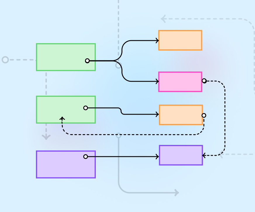
Your entities have something in common. Find it.
A list is not a model. A list is just words. To make it useful we need to do what the transformer did with language: cluster things that belong together.
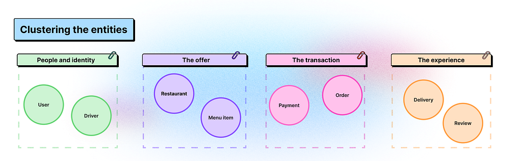
Our eight entities don’t all live in the same neighborhood. Let’s group them:
- People and identity: User, Driver. These are the humans in the system, each with their own context, permissions, and goals.
- The offer: Restaurant, Menu Item. This is what’s available, what can be ordered, what belongs to whom.
- The transaction: Order, Payment. This is the moment something happens, money moves, a commitment is made.
- The experience: Delivery, Review. This is what the user actually feels, the wait, the arrival, the reflection after.
You could take this clustering and sketch wireframes right now, but it’s still not enough. Because we haven’t told the system how these clusters relate to each other.
This is where most teams stop too early.
The relationships your AI can’t guess
It might feel obvious that an Order belongs to a User, or that a Delivery references a Driver. But obvious to a human and explicit to a system are very different things. The model can’t infer relationships the way we do. It needs them stated.
When working with AI tools, giving them more stuff doesn’t always give you better results. I learned this the hard way while trying to spin up a proof of concept. I had Figma Make, a PRD, a design system, a list of requirements. I thought it would take an afternoon. It did not. The outputs were generic, misaligned, and confidently wrong in ways that were hard to even explain. The tool just didn’t know where to put its attention.
That’s when I dove into data models seriously.
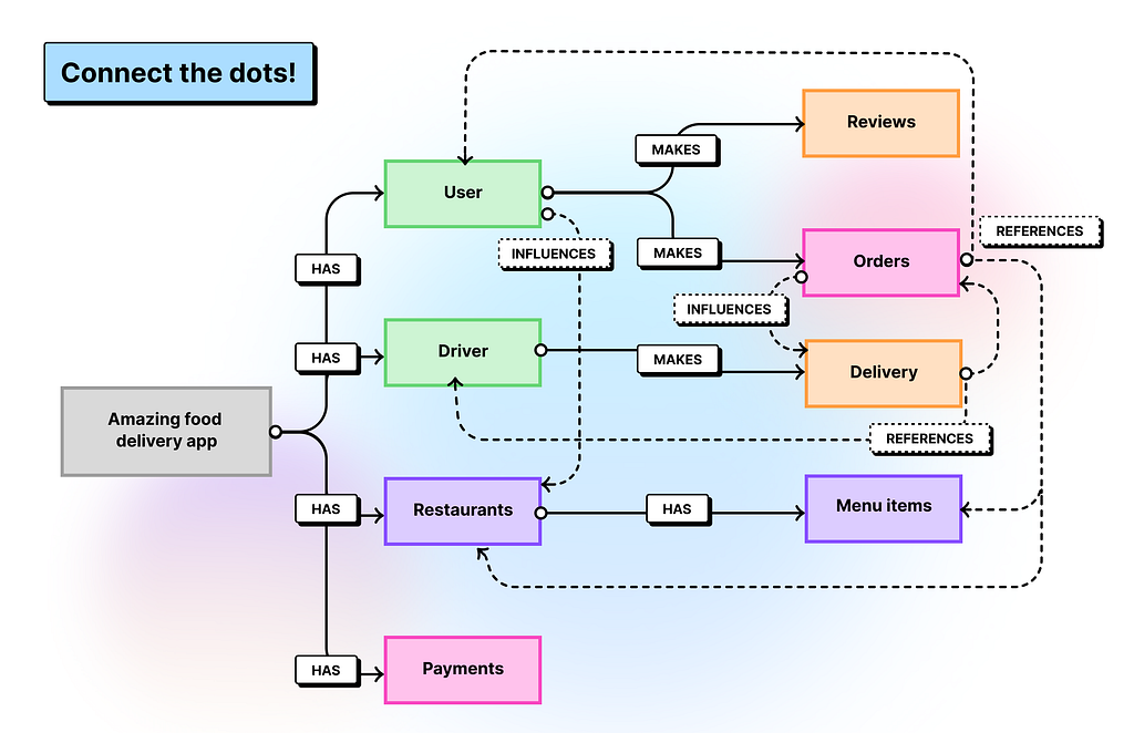
Let’s make the relationships explicit, using three questions:
- What does it produce? One thing creates another as a direct result. A Restaurant produces Menu Items. An Order produces a Payment. A completed Delivery produces a Review.
- What does it reference? One thing points to another that exists independently. An Order references a User, a Restaurant, and one or more Menu Items. A Delivery references an Order and a Driver. Neither owns the other, they just know about each other.
- What does it influence? One thing shapes how another behaves or is prioritized, without creating it directly. User preferences influence which Restaurants surface first. Order history influences delivery time estimates. This is the relationship type that matters most to AI, because it’s how context shapes decisions without being explicitly stated every time.
Those three questions are your connectors. And if you’ve ever drawn a user flow where one screen leads to another, or mapped ticket dependencies in a sprint, you’ve already done this kind of thinking. The diagram just makes it explicit and shared.

This is also where the parallel to the attention mechanism closes. The entities are the clusters. The connectors are the attention. You’re defining the relationships that give those things meaning.
Now step back. Look at what you have. A set of named, defined entities. Grouped into clusters that make intuitive sense. Connected by relationships that are explicit enough for a model, a designer, a PM, and an engineer to all read the same way.

Build it together
When I first presented this to my team I wasn’t sure how it would land. Data models sound technical. The word alone can make a designer’s eyes glaze over or make a PM reach for their phone. So I showed it instead of explaining it. Here’s the model, here’s the prompt I built from it, here’s what Figma Make produced.
The prompt wasn’t long. It looked something like: “Using this data model… create a … for a user who… and wants to complete….” One prompt, took 5 minutes, put it into Figma Make and you get something you can concept test, not a generic card layout, but a screen that knew what to surface and what to hold back.

PROMPT EXAMPLE: Design the order tracking screen for a hungry person who has just placed an order on a food delivery app. Use the following data model as the underlying logic for every decision you make about what to show, what to hide, and what to prioritize.
**Entities and their attributes:**
User: has a location, preferences, and an order history.
Restaurant: has a name, a menu, hours, and a location.
Menu item: has a name, a price, and belongs to a Restaurant.
Order: has a status, a list of items, a total, and a timestamp. References a User, a Restaurant, and one or more Menu Items.
Driver: has a name, a location, and an availability status.
Delivery: has a route, a status, and an estimated time. References an Order and a Driver.
Payment: has a status and belongs to an Order.
Review: references the Order, the Restaurant, and sometimes the Driver.
**Cluster priorities for this screen:**
The experience cluster (Delivery, Review) is the primary focus. The user is waiting. That feeling is the design constraint.
The transaction cluster (Order, Payment) is secondary. Show confirmation, not complexity.
The offer cluster (Restaurant, Menu Item) is reference only. It already happened.
The people and identity cluster (User, Driver) surfaces the Driver prominently because movement is what the user cares about right now.
**Relationships to reflect in the UI:**
Delivery references a Driver: show the Driver's name and live location as the primary element.
Order references a Restaurant and Menu Items: show these as a collapsible summary, not the focus.
User preferences influence what surfaces first: if the user has ordered from this restaurant before, surface a familiar detail that builds trust.
Order history influences tone: returning users get a lighter, more confident experience. First-time users get more guidance.
A completed Delivery produces a Review: when status changes to delivered, transition immediately into a review prompt anchored to the Order and the Restaurant.
**UI states to include:**
Order confirmed, preparing, out for delivery, delivered.
Driver location updating in real time.
Estimated time prominent and updating.
Review prompt on delivery completion.
**Tone:** Calm, clear, reassuring. The user is hungry and waiting. Every element should reduce anxiety, not add to it.
The engineer looked at the diagram and said “this is what we do.” Not exactly the same format, not the same vocabulary, but the same idea. A shared map of what exists, what connects, and what it all means.
A designer can facilitate it, and should. The designer’s job is to translate everyone’s input into a coherent shared structure. The PM brings requirements and context. The engineer brings technical judgment: what’s feasible, what’s fragile. The designer listens, organizes, and maps. By the time you’re done you have something the engineer can build from, the PM can write tickets against, and the AI tool can actually reason over.


This connects directly to the first principle in my previous piece on Agentic UX: think systematically.
Agents rely on structured systems to act consistently. If the product’s flows, labels, and hierarchies are messy, agent actions will feel random or confusing.
The data model is where that systematic thinking starts, before the wireframes, before the tickets, before the prompts. It’s the foundation everything else builds on.

Before your next sprint
When an AI tool doesn’t deliver, it’s rarely the model’s fault. And it’s rarely the prompt, at least not in isolation. A prompt can only reason over what it’s been given. If the definitions are vague, the relationships undefined, the language inconsistent across your team, no amount of prompt craft will close that gap.
The data model is the cheapest investment you can make before building anything with AI.
A data model saves you from the meeting where everyone argues about what “intent” means. Clarity upfront is the most efficient thing you can do. For your team, for your tools, and for the AI that will eventually try to reason over everything you’re building.
Also worth knowing: 51% of Figma users working on AI products are now building agents, up from 21% the year before. The teams moving fastest are the ones who figured out the foundations first.
And if you want to take this one step further, the next piece in this series goes deeper into how to turn this map into a task diagram your whole team can build together, and how to use it to test a concept before a single ticket gets written. Because a shared language is only the beginning. What you do with it is where it gets interesting.
References
“Attention Is All You Need,” Vaswani et al., Google, 2017
“I Finally Understood ‘Attention Is All You Need’ After So Long. Here’s How I Did It,” Olubusolami Sogunle, 2025
Attention Is All You Need [Video], Yannic Kilcher, 2017
What is an entity relationship diagram, Figma Resource Library
Speaking the Same Language: Engineering and Design in Product Teams, SafetyCulture Engineering, Medium, 2024
Agentic UX: 7 principles for designing systems with agents, Alexandra Vasquez, Medium Bootcamp, 2026
Figma 2025 AI Report, Figma Blog, 2025
Data models: the shared language your AI and team are both missing was originally published in UX Collective on Medium, where people are continuing the conversation by highlighting and responding to this story.