
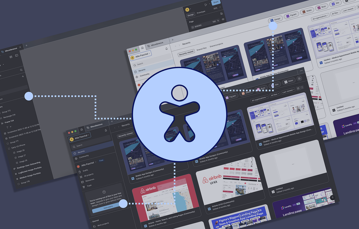
Figma’s accessible updates
Figma has introduced both an enhanced contrast mode (supporting both light and dark themes) as well as improved keyboard navigation. These aren’t “nice-to-have” features, but show core advancements that align with WCAG accessibility standards and real user needs. Let’s look at both features.
Enhanced contrast mode
This feature may seem obvious and simple, but you’d be surprised how many design tools don’t allow users to customize their interface beyond swapping between light and dark themes.
When enhanced contrast mode is toggled on, the difference is very noticeable on UI controls like buttons, as well as the dividers separating sections of the interface.
This feature significantly impacts users with low-vision or even users working outside in the sun. Not only that, it helps clarify what is currently selected or interactive for all users.

Here is a comparison on the color contrast ratios with the enhanced mode turned on/off:
- “Design” file button: 1.24:1 (off) → 4.6:1 (on)
- “View plans” button: 2.99:1 (off) → 7.72:1 (on)
Note: The “View plan” button actually fails color contrast requirements when turned off (must be 4.5:1 at minimum).
To see the enhanced contrast mode for yourself:
- Select the “F” Figma logo to open the main menu
- Select “Preferences” → “Accessibility settings”
- Toggle on “Enhanced contrast mode”

Though some elements have no change when the mode is toggled on, like badge components and hover states, I expect this feature to allow greater visibility as Figma continues to update.
Keyboard navigation
The ability to navigate and use design tools with only a keyboard has been notoriously impossible. Of course, many tools provide keyboard shortcuts, but those are intended for more advanced users. So what about users who can’t use a mouse or trackpad?
Figma has improved its keyboard-friendliness by offering users to navigate between top-level sections of the UI, adjust the UI, as well as add and select objects on the Figma canvas.

Not only does this positively impact users who cannot use a mouse, but also improves the workflow for all users who are keyboard-first.
Here are some keyboard commands to trial out in Figma:
- Navigate top-level areas of the UI: F6 // Control-F6
- Navigate in and out of layers on the canvas: Return // Shift-Return
- Enlarge the Figma UI scale: Option-Shift-Command-=
- Reset the Figma UI scale: Option-Shift-Command-0
- Pan the Figma canvas: Arrow keys // Shift-arrow keys
- Add object to canvas: Command-K (open Action menu) → Search for tool → Enter / Return (place object on canvas)
Note: You don’t have to enable any setting to access the keyboard commands; they are on by default (as they should be).
Though this does help Figma get closer to WCAG standards for keyboard accessibility, some features are still only functional with a mouse or trackpad. For example, adding objects that require multiple clicks, like a line or vector paths, cannot be done with a keyboard.
This is a great start to achieving full keyboard accessibility for a design tool. Maybe Figma will be a pioneer in supporting vector-based drawing using only a keyboard (I hope so).
Large accessibility gaps in design tools
Outdated assumptions
Even with Figma’s progress, most design tools remain inaccessible at a fundamental level. Accessibility has infamously been forgotten and/or disregarded across the entire creative industry.
But it’s not that accessibility was never important; many of these products were built on assumptions about who their users are. They pictured able-bodied, well-sighted, and mouse users. So many of the industry’s core design platforms exclude anyone who doesn’t fit that archetype.
Adobe is a prime example with Illustrator, Photoshop, and InDesign were all built before accessibility frameworks became standard. Many of the core functions like drawing vector shapes or selecting anchors depend on a mouse/ trackpad. Though you can open menus and panels with a keyboard, creating designs without a pointer device is pretty much impossible.

Adobe does have an accessibility initiative and has introduced improvements in products like Acrobat, but its creative tools exclude people outside the ideal, archetypal user.
Beyond keyboard inaccessibility
The gaps don’t stop at keyboard accessibility; visual accessibility is also limited. Many creative tools still lack adequate color contrast as well as sufficient UI customization for the users who need it.
For instance, interfaces rely heavily on subtle visual cues to indicate active layers, which makes it difficult for users with low-vision. These tools also include dense, abstract toolbars and hidden commands that create steep learning curves; though this impacts everyone, it’s detrimental for neurodivergent users.

When an interface itself isn’t perceivable or intuitive to all users, it limits who can participate in design. The industry unintentionally reinforces exclusion at the very starting point of creation. But creative tools need to account for broader necessities outside the assumed user so accessibility can be both produced and practiced.
Inclusive design tools matter
It determines who gets to use them
When the tools we use to design aren’t accessible, it creates a ripple effect.
If creative tools exclude people with disabilities, then the perspectives building digital products remain limited, and the designs created in the tools are inherently less inclusive.

Accessibility in design tools isn’t just an internal UX issue; it’s a diversity and equity issue that directly impacts the products people use every day.
They better shape designers
Inclusive design tools reframe how designers think. When accessibility is built into the tools themselves, it unknowingly teaches better design habits. Designers can internalize accessibility practices by experiencing them:
- Perceivable: Noticing high color contrast, focus indicators, and clear visual hierarchy
- Operable: Understanding the importance of keyboard access and flexible interactions
- Simple: Recognizing how clean, intuitive UI improves the experience for all users
By embedding these principles into everyday workflows and tools, accessibility is normalized as a part of good design practice.