
So I’d like you to notice something: by the time you already felt a slight sense of alert from seeing the red color, your brain still needed another 200–300 milliseconds to fully decode what was actually happening.
And now, my dear designers, I invite you to try a little experiment. Take any interface design and increase the duration of all animations by 250 milliseconds. You’ll instantly feel how even such seemingly tiny time differences can dramatically change your perception of what you see.
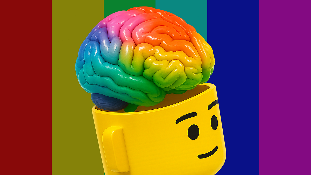
The reality of color
The second aspect of color that absolutely fascinates me is its duality, especially when it comes to how we perceive it. On one hand, color is a subjective experience but on the other, it’s something we can measure with extraordinary precision.
The immeasurable side of color
We know that every person is unique, and we still can’t definitively prove or disprove whether we all see colors in the same way as Prof. Semir Zeki states in his Lecture on Color Perception. What we do know is that perception depends on the cone cells in our eyes and their quantity and ratio can vary from person to person.
And another mystery remains, how exactly our brain interprets colors, and whether it does so in the same way for everyone. Some people can see more or fewer shades, while others might not distinguish basic colors at all. In very rare cases, some individuals may even experience monochromatic vision, not only due to missing cones, but also as a result of brain damage.
The true nature of color
Color doesn’t actually exist in nature. Yes, that’s right: leaves aren’t really green, the sky isn’t truly blue, and even an emerald isn’t actually green. All of this is an illusion. Our brain’s interpretation of light according to an article Where Perception Meets Reality: The Science of Measuring Color.
In reality, what we see is not color but light. Depending on the wavelength of that light, the cone receptors in our retina are activated in different ways. The wavelength changes because light reflects off objects and that reflection shifts the wave. What’s fascinating is that this shift is influenced not just by the objects themselves but by their atoms.

This principle is used by astrophysicists to determine which elements dominate on distant exoplanets: by calculating how specific atoms interact with light. With ultra-sensitive sensors, we can detect even the slightest variations in wavelength reflected from those planets.
And here’s the key point the atom, the fundamental building block of all matter, has no color of its own. It merely interacts with photons. So, the matter and objects around us are colorless without light.
So we’ve now touched on the second side of what makes color so fascinating: it’s a sensory stimulus that can be described quantitatively: wavelength, intensity, saturation.
Unlike many other aspects of psychology, color is something we can measure with extreme precision, minimizing any margin of error in experimental data and making it one of the most reliable subjects for psychological research. Yet it remains a complex phenomenon because, we still can’t fully measure the brain that perceives it.
The color model I trust most
At the end of the 19th century, long before Johannes Itten’s theories, Wilhelm Wundt laid the foundation for the psychological classification of color in his work Principles of Physiological Psychology.
In my opinion, every designer should be familiar with and understand this framework. Wundt was the first to describe color not merely as a physical property of light, but as a set of psychological parameters of perception forming so called “psychological space of color”, defined by three independent dimensions:
- Hue — the actual type of color (red, green, blue, etc.)
- Saturation — the degree of color purity, or how much “gray” is mixed into it
- Brightness — the perceived lightness or luminance of the color
This concept became the foundation for the later development of these ideas and the creation of the HSV color model.

Personally, I tend to use this model most often in design, as it gives far greater control over the visual outcome compared to the more rigid machine-encoded HEX or the physically-based RGB formats. HSV allows you to work with color in a way that feels more natural and intuitive, while still providing precise control for subtle adjustments in the final result.
The influence of color on humans
Let’s now move from how we perceive color to how it affects us — and how we interpret it from a scientific point of view.
Emotional response to color
We’ve already touched on the emotional component earlier, so let’s start there. Warm colors are known to speed up reactions and increase physiological arousal. According to the Color-in-Context Theory, warm colors stimulate the nervous system and enhance motor responses. That’s exactly why shades of red, orange, and yellow are so often used for CTA buttons, alerts, and error messages, anywhere we need to grab attention instantly or create a sense of urgency.
At the same time, the same study notes that cool colors help reduce stress and create a sense of stability. Blue and green hues are shown to lower anxiety levels, slow down breathing, and evoke feelings of trust and safety.
That’s why these colors are so commonly used in banking, healthcare, and other sensitive interfaces — wherever calmness, reliability, and reassurance are essential.
Cognitive response to color
We also know that color influences cognitive functions such as concentration, memory, and creativity. In a 2009 study Blue or Red? Exploring the Effect of Color on Cognitive Task Performances, researchers found that blue enhances creative thinking and promotes exploration of new ideas, while red improves focus and attention to detail. This means that through color, we can influence not only the emotional state of our users but also guide their cognitive processes, subtly steering their minds toward the state most aligned with the task at hand.
Cultural perception of color
It’s important to note that the psychological response to color is largely universal among humans, according to A Cross-Cultural Study of the Affective Meanings of Color, emotional reactions to a color’s brightness and warmth are not dependent on cultural or social context.
However, color can also acquire symbolic meaning such as associations with mourning, happiness, or pain, which are shaped by socio-cultural factors. For instance:
- White represents purity in Western cultures but mourning in China.
- Red is often seen as danger in the West, yet as a symbol of luck and prosperity in Asia.
- Green generally feels positive and natural to most of us, but in Indonesia, it signifies “forbidden.”

So as designers, we can confidently use color to communicate directly with the limbic system, influencing emotion and attention on a biological level but we must also remain aware of cultural context when using color as a symbol, such as the familiar “traffic light logic” so often applied in interface design. For example, until the 20th century, the Japanese language had no separate word for “green.” All hues between blue and green were described by the same word 青い (aoi), meaning both “blue” and “green”, which has led some lights to be a bluer shade of green.
Why every designer should start with color psychology
I’m sure these theories form the essential foundation every designer should enter the profession with and keep exploring throughout their career. Because in the end, we are learning to speak emotions with our users, and color is what speaks directly to their emotions.
In my opinion, many of these principles shouldn’t be treated merely as hypotheses that demand constant validation, but as axioms we can confidently build upon. No matter what you test or how you test it, red will always attract more attention than blue, as I wrote earlier, some things are universal.
It’s important to remember that unless you plan to conduct research on hundreds, maybe thousands, of participants using brain-scanning equipment, you’re unlikely to reinvent the wheel or to prove, through ordinary user testing, a new universal psychological truth about color that hasn’t already been explored by scientists.
And yet, that’s exactly where I find beauty in being a designer. Because we work with people, not with algorithms. Our role is to ask, to listen, and to adapt, to consider the socio-cultural context, the personal story, and the environments that shape how your user group perceives both color and design.