
How your design decisions translate to screen reader output
Most designers spend their time editing and improving what our users see, like color palettes, layout grids, and type hierarchy. We obsess over high-fidelity polish and happily push pixels until everything feels right.
But there’s another version of your interface that most designers never experience–how the interface is announced by a screen reader.
Users who rely on screen readers don’t really care about the visual polish of an interface; they just want the interface to be compatible with their assistive technology so they can understand what’s being shown on their device.
When someone navigates a digital product using tools like VoiceOver or NVDA, your meticulously designed UI is translated into a sequence of spoken content. Screen readers announce elements like buttons, headings, and interactive states.

Screen readers can’t interpret the intent of the UI based on how it looks; it’s dependent on how the UI is structured and defined. The screen reader doesn’t know that an icon button means “download” or that the large, bold text is supposed to be a heading…they only announce what’s explicitly there.
That means every design decision you make, like the components you choose and the intended hierarchy of the page, must be conveyed in a way that doesn’t depend on visual cues. Though this layer of translation is invisible to most designers, it’s critical to someone else.
Let’s go through how screen readers work, where designers (accidentally) break the screen reader experience, and how you can start to design with screen readers top of mind.
How do screen readers work?
To design for screen readers, you first need to understand that the UI you create will be reduced to a linear stream of information. There’s no visual hierarchy or spatial relationships…just the content and its meaning read aloud in a specific sequence.
The UI becomes a linear experience
Screen readers like VoiceOver, NVDA, and JAWS dissect the underlying structure of your interface and announce what they find. Sometimes, what’s announced may not be what you intended; it’s just reading what’s been defined in the code.

At a basic level, UI elements are communicated through three pieces of information: roles, names, and states.
- Role: Tells the screen reader what the element is (button, link, heading)
- Name: Also called “accessible name;” tells the screen reader what the element is called and answers what it does (“Submit application” or “Download”)
- State: Tells the screen reader what’s happening to the element, which is important for dynamic components like dropdowns and toggles (expanded/collapsed or checked/unchecked)
Why visual design doesn’t automatically translate
Instead of relying only on visual cues (like size, color, and proximity) to communicate meaning, you also need the underlying semantic structure. If that structure isn’t there or isn’t clear, the experience becomes fragmented or even unusable.
Imagine you have a Card component in your design, which includes:
- A bold title
- A short description
- A “Learn more” link
- A bookmark icon in the corner
Visually, it’s intuitive and the hierarchy is obvious. But a screen reader might announce something like:
- “Learn more, link.”
- “Icon, button.”
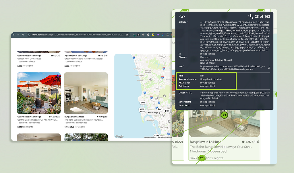
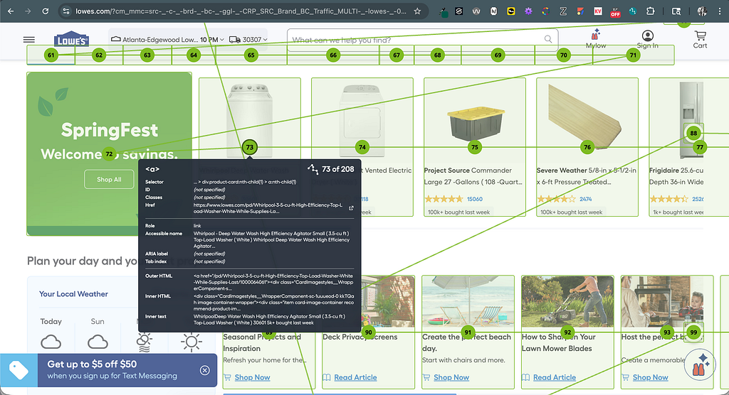
Because the card component’s structure isn’t explicitly defined, screen reader users get little context or content relationships The screen reader can’t reconstruct the visual relationships visually created without heading tags, descriptive labels, or correctly assigned roles.
Screen readers act as navigation aids
Not only do screen reader users listen to the reader’s output, they navigate. Users can jump between headings, skim through links, or move across different sections of a page with a few keyboard presses.
Users easily become confused when they pull up a list of links and hear:
- “Learn more, link.”
- “Learn more, link.”
- “Learn more, link.”
But the UI isn’t visually broken, it’s just that the element’s meaning and context wasn’t announced by the screen reader. Since designs are typically explored in pieces vs. top-to-bottom, each piece needs to make sense on its own.
Key takeaway: Screen readers don’t interpret visual designs; instead, they interpret the structure embedded in the design’s code.
Where designers (accidentally) break the experience
Most screen reader issues aren’t caused by bad intentions; they’re caused by gaps between visual design and its semantic meaning. Though the UI looks polished and works for sighted users, the screen reader experience doesn’t offer the same quality.
Let’s look at some common ways designers unintentionally create friction for screen reader users.
Vague labels that lose meaning out of context
Imagine hearing a list of links that say:
- “Learn more.”
- “Click here.”
- “View details.”
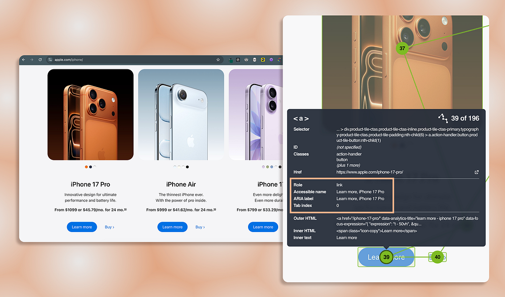
When the links are surrounded by content that provides additional context to the link (like within a card setting), the visual layout works and is usable. But screen reader users often navigate by pulling up a list of links, and they completely lose that additional context.
Instead of clarity, screen reader users hear, “Learn more.” “Learn more.” “Learn more.” Each link is indistinguishable from the next, and the user’s experience is repetitive and frustrating.
Over-reliance on visual cues
Many design decisions rely on affordances that aren’t announced by screen readers:
- Color to indicate status (red means “error”)
- Meaningful icons without programmatic labels (magnifying glass means “search”)
- Placeholder text acting as an input field’s label (text disappears once field is filled)
These seem visually obvious, but don’t translate to a screen reader. If an icon button doesn’t have a proper name, it will be announced as, “Button” with no action or meaning.
When color and graphics are the only way status or meaning are communicated, important information is lost to screen reader users.
Visual hierarchy without real structure
Designers create visual hierarchy using size, spacing, and color. But if the hierarchy isn’t reflected semantically, the screen reader doesn’t know the large, bold text is a heading.
What looks like a well-structured page is just a wall of text to screen reader users. For instance, if you use large, bold text to indicate a heading, a screen reader can’t automatically infer the text is a heading without proper heading tags.
Also, real structure allows screen reader users to navigate; because without it:
- Users can’t skim the headings of the page (from one <h2> to the next)
- Users can’t jump between page sections (from <header> to <main> content)
- Users lose their sense of place (no “you are here” indiction)

Component misuse
A common example of misusing components include:
- A link styled to look like a button (and vice versa)
- A tablist built from plain links without proper roles
Though it seems like a harmless stylistic decision, it changes the component’s semantics and how screen readers treat it. For instance, when the screen reader announces a link, the user expects the link to navigate them elsewhere; while they expect the button to trigger an action.
When component roles don’t match the behavior, users get misleading cues about what will happen when the component is activated. It’s important to use components for their correct purposes so experiences are consistent and predictable.
Key takeaway: You don’t need to learn to code; you need to shift how you think about design so visual meaning also exists in the screen reader layer.
Design with the screen reader layer in mind
Closing the gap between what you’ve designed and what’s announced by screen readers doesn’t require accessibility or production code expertise. It’s about being more intentional with the decisions you’re already making.
Though screen reader output depends on how the design was developed, designers have more influence over the screen reader experience than they think.
Think “role, name, state” while designing
You don’t need to memorize ARIA specs to improve accessibility. Just ask yourself three questions as you design elements like interactive or informative elements:
- Role: What is this?
- Name: What does it do?
- State: What’s its current condition?
For example, let’s say I have an interactive button using a “cart” icon without a text label:
- Role: Button (<button> or role=“button”)
- Name: Adds items to the user’s cart (“Add to cart”)
- State: Is the button enabled or disabled? (aria-disabled=“false”)
Also, calling this out in your designs (annotations or dev-handoff notes) can dramatically improve how accurately the screen reader experience is built from the start.
Write labels that make sense on their own
If a screen reader user heard an element’s label without its surrounding context, would it still make sense? Sometimes you want to reduce clutter and cognitive load, but some users need additional context.
Instead of links that are announced as, “Learn more” or “Click here,” use:
- “Learn more about pricing plans”
- “Download the report”
But you don’t have to design long text strings in the visual UI to create this effect. Though the link’s visible label reads as, “Learn more,” the invisible label provides more context. This can be achieved using ARIA attributes like aria-label or aria-labelledby.
Design for style AND structure
If hierarchy matters visually, it should exist structurally (which is pretty much all the time).
Ways this works in practice:
- Use real headings via HTML heading tags or role=“heading” (not just styled text)
- Group related content intentionally by wrapping them in a <section> or making sure labels are properly associated with a field (not relying only on visual proximity)
- Preserve logical reading order so the visual experience matches the screen reader experience (especially important when UI includes more than 1 column or grid)
When designing your UI’s layout and structure, ask yourself, “Can someone understand and navigate my layout without seeing it?”
Bring accessibility into your design process
Accessibility is typically not considered until after designs are finalized and handed off to engineering. At that point, accessibility fixes become constraints and probably won’t be addressed (AKA, it’s too late in the process).
Instead, bring accessibility in your design workflow:
- Reference WCAG criteria designers are responsible for (i.e., color contrast and focus order)
- Add accessibility notes directly into your design files (i.e., icon button label is “Add to cart”)
- Partner with engineers on interaction patterns (i.e., focus indicator, keyboard behavior, component states)
- Validate decisions with an accessibility SME (if possible)
Accessibility is part of how designs behave with and communicate to all users; it’s not an afterthought to what the designs look like visually.
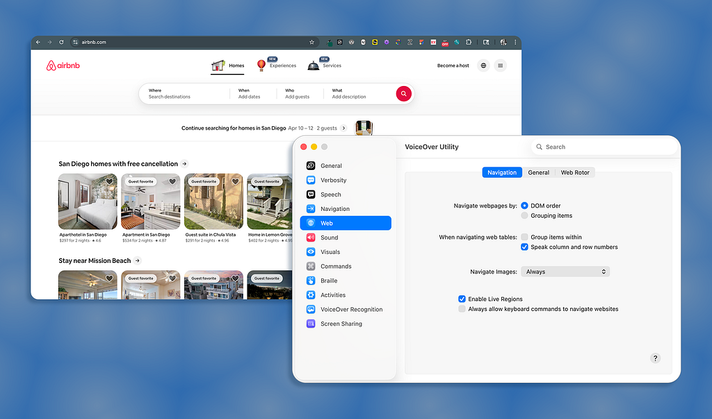
Actually use a screen reader
Screen readers can be a jarring experience; especially on the first try. The experience of navigating and understanding a webpage completely changes. But you don’t need to become an expert user…just try navigating one of your designs (or even any live website) using a screen reader (VoiceOver for macOS or Narrator for Windows).
Here are quick tips to use the native screen reader on macOS and Windows.
- Turn on and off: Command + F5
- Open Rotor: Control + Option + U
- Close Rotor: Escape
- Navigate by/read text: Control + Option + Left/Right Arrows
- Navigate by/read controls: Tab and Shift + Tab
- Navigate by/read headings or links: Open Rotor + Left/Right Arrows
Note: Control + Option is Voiceover’s modifier keys (known as “VO”).
- Turn on and off: Windows Key + Control + Enter
- Navigate by/ read text: Caps Lock + Left/Right Arrows
- Navigate by/read controls: Tab and Shift + Tab
- Navigate by/read headings: H and Shift + H
- Navigate by/ read links: K and Shift + K
Note: Narrator’s modifier keys are Caps Lock or Insert (you can use either).
If you attempt to use some of the tips from above, you might notice frustrating experiences like:
- Labels not matching what’s visually displayed (or not announced at all)
- Missing heading structure (large text isn’t picked up as a heading by the screen reader)
- Unclear interactions (not being able to tell which tab is selected or not in a tablist)
Using a screen reader first-hand doesn’t fully simulate the experience of users who rely on assistive technology, but it is a fast way to build empathy and change how you think about design decisions.
Key takeaway: Better accessibility starts with more intentional design decisions considered at the start of the design process; it doesn’t require more complexity.
Most designers never hear the interfaces they create…they only see them. But that doesn’t mean different perceptual experiences don’t exist. For screen reader users, that hearing layer is the product. And every decision you make, from page structure to UI components, determines if the experience will be usable or frustrating.
By understanding your designs will be interpreted beyond the visual screen, you can begin to design with intention. “Good” interfaces go beyond visual appeal by just making sense no matter how they’re experienced.
The invisible layer of UX most designers ignore was originally published in UX Collective on Medium, where people are continuing the conversation by highlighting and responding to this story.