
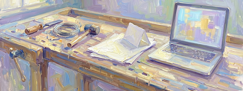

Creative makers and builders have always learned their medium by working with it, from grinding pigments to HTML. Models are the next material, and you need to learn them by building.
The field keeps arguing about whether designers should code, as if that question were new.
It’s not new.
Art and design have always been taught through materials, going back centuries.
In the 1390s, the painter Cennino Cennini wrote a handbook that’s still translated today on grinding pigments, and that history still runs through my own family as builders and creators. My mother, Jean Neeman, ground her own pigments as a conservator for the Los Angeles Museum of Art, the Getty and Hearst Castle, and I watched her repair Chinese statues that were over 600 years old with original materials to restore history.

She lived that craft, as I wrote in Everything I Know About UX I Learned From My Parents. I learned print through paste up, developing film for prints, and running film output.
I understand that knowing the material is a timeless need, and most designers I meet don’t understand it, because their tools hide it. We need to respect it as part of the craft.
The reality is that visual tools like Figma and Sketch are an abstraction, and real craft happens in the final mile, working with the material. Great designers have always used the materials they had, and I’ve always written code as part of the job to understand mine.
On the web, that meant HTML, CSS, Javascript and whatever else that made it work. Artificial intelligence is the new material, teaching the same lesson faster.
The designers doing the strongest work with models run them and read the output. That takes sampling code: a loop asking one question over and over until the model’s habits show.

Study the Bauhaus Workshops
In April 1919, Walter Gropius published the founding manifesto of the Bauhaus, and its demand was direct.
As art historian Magdalena Droste explains in The Bauhaus Manifesto, Gropius told architects, sculptors, and painters to turn to the crafts. The curriculum ended in a list of workshops. Students learned wood, metal, glass, and weaving by cutting, bending, and threading them.
Josef Albers made the point with almost nothing. In his preliminary course, Droste notes, students had to make a flat sheet of paper stand on its own, or bend a straight wire until it held its shape.
A drawing can suggest a chair, but only the wood can tell you where it will split.
That habit produced the school’s best-known work. Marcel Breuer headed the carpentry workshop and bent tubular steel into chairs, and Herbert Bayer went on to run the printing and advertising workshop.
They knew their materials because they had worked them. Every new medium since has sent designers back to a bench of some kind, and the last two benches have been made of code.
Hand-Code 1990s Web Pages
The web forced the same return, and it started with a blank file.
In the mid-1990s, the design tool for the web was a text editor: Notepad on Windows, SimpleText on the Mac. You typed tags, saved the file, and reloaded the browser to see what you’d made. My earliest web credit, the Oliver North home page, came out of that era.

Dedicated tools followed quickly, and each one moved the designer a step further from the markup:
- BBEdit (1992), a Mac text editor that added HTML tools in 1994.
- HoTMetaL (1994), an early HTML editor that showed where each tag began and ended.
- PageMill (1995), Adobe’s visual editor for print designers.
- FrontPage (1995), a visual editor that Microsoft bought in early 1996.
- HomeSite (1996), a Windows editor built for people who wanted to write the HTML themselves.
- Dreamweaver (1997), Macromedia’s visual editor.
The designers who got the most out of the visual editors still opened the code underneath. They trusted the canvas only after checking the page in more than one browser.
A visual editor showed one browser’s best case, and the markup showed the rest.
In 2000, John Allsopp wrote A Dao of Web Design for A List Apart, arguing that the control designers knew in print was a product of the printed page’s limits.
Ten years later, ethan marcotte opened Responsive Web Design with a quote from Allsopp. He built a sample page on a fluid grid with flexible images and media queries, then showed the layout changing shape as the window narrowed.
Responsive design came out of a designer’s style sheet, and no mockup would have found it.
Five years later, Frank Chimero gave the idea a name in The Web’s Grain, writing that “every material has a grain, including the web.” He argued that the field’s best techniques grew out of that grain, and that sites built against it come out fragile and awkward.
Test Model Output Variation
Models break the mockup in a new way. A static screen shows one answer, chosen by the designer and usually the good one. A model returns a different answer each time, and that spread is the thing you’re designing for. Call the chosen answer the one-sample mockup: a screen built around the output the model gives on its best day.
In legal tech, where wedesigned search and summarization, every summary in a mockup was correct, because a designer wrote it.
- In 2017, Lars Erik Holmquist argued in Intelligence on Tap: Artificial Intelligence as a New Design Material that designers should treat the technology as a material with its own limits.
- In UX Design Innovation: Challenges for Working with Machine Learning as a Design Material (2017), Graham Dove and colleagues surveyed UX practitioners. They suggested that machine learning had seen little design innovation, possibly because it was a new and difficult material.
- Qian Yang’s 2020 dissertation at Carnegie Mellon University, Profiling Artificial Intelligence as a Material for User Experience Design, went further. It traced those difficulties to two roots: uncertainty about what a system can do, and the complexity of what it might output.
A mockup is one sample, and the product is the distribution.
The Doherty Threshold entry on UX Guidelines, my own reference site, puts the point where software starts to feel conversational under 400 milliseconds. A static frame can’t show a four-second wait.
Bret Victor built a whole talk, Inventing on Principle (2012), around the idea that creators need an immediate connection to what they create. You find the spread, the misses, and the delays only by running the model again and again.
Code Prototypes Against Models
Josh Clark tied the two eras together in his 2018 talk The New Design Material, calling machine learning “a design material in the same way that HTML and CSS is.”
In Addressing UX Practitioners’ Challenges in Designing ML Applications (2023), K. J. Kevin Feng and David W. McDonald of the University of Washington ran a study with 27 UX practitioners. Each got a tool to build and test simple models while designing an app.
Hands-on experimentation helped them match model behavior to user goals, invent interface features for correcting the model, and spot ethical risks. One participant explained that without testing, you don’t know “how often or in what ways it’s going to error.”
The authors located the bottleneck in fabrication, the stage where models get made, because designers are usually kept away from it. Their tool needed no code at all.
Today, for language models, a few lines of code are the shortest route to the same hands-on access. Geoffrey Litt saw it coming in Malleable software in the age of LLMs (2023), arguing that language models would let ordinary users build small tools from scratch.
Designers have kept themselves at arm’s length from the material, and that distance is the bottleneck they can no longer ignore.
That distance is closing. Figma’s 2026 AI report found that the share of designers participating in development doubled in a year, from 21% to 41%.
Tools like Claude Code, Cursor, and Figma Make let a designer describe a prototype, wire it to a live model, and watch what breaks in a single sitting.
Not every designer agrees that code belongs in the job. Alan Cooper wrote in Should Designers Code? (2017) that “coding is not a skill necessary to be a top notch interaction designer.”
Karri Saarinen of Linear warned in Design Is More Than Code (2025) that production-first habits can erode the thinking behind a design. Both warnings are about code that ships.
Sampling code gets thrown away the same afternoon, and its only job is to show you the material.
Write AI Evaluation Sets
Sampling code doesn’t need to ship. It works like a test bench, and its most valuable output is a record of every case where the model broke the design. Wood doesn’t change its grain overnight, but a model can change with a single provider update.
Engineers already have a name for this file: an evaluation set. Designers are well placed to write it. They know which failures users notice first, like the answer that runs past the edge of its card or the wrong date stated with total confidence.
A design tuned to last month’s model can fail without a single pixel moving.
Four habits turn the record into working practice:
- Call the model directly. Ask Claude Code or Cursor for a script that sends real product inputs to the model and prints the answers, and read them before you draw a screen.
- Run each prompt 50 times. Sort the answers by length, tone, and accuracy, then design for the longest and the most wrong rather than the typical one.
- Bring the spread to review. Put the two worst of the 50 answers beside the mockup in design review, and decide together which ones the screen must survive.
- Save failures as test cases. Keep every output that broke a layout or misled a user in a shared file, so engineering reruns it whenever the model or prompt changes.
Run the Model First
Gropius moved students out of drawing rooms because drawings hid what materials would do.
Designers on the early web learned the same thing in a text editor, and Marcotte proved it with a working page. The debate over whether designers should code has always been a debate about the material and how close designers can get to it.
For artificial intelligence products, the material is the model’s behavior across thousands of inputs. You won’t find it in a frame on a canvas. You find it by running the model, reading everything that comes back, and keeping the failures somewhere the team can see them.
These days I describe my job as building, and that’s the reason: I can’t design how a model-backed product works until I’ve watched the model work.
Next time your team reviews an artificial intelligence feature, skip the one-sample mockup. Run the prompt 50 times, bring the worst answer to the review, and design the screen that survives it. Notice which answers the whole room argues about, because those are the cases a static mockup was hiding.
That’s the workshop now, and the door is open to anyone willing to write a few lines of sampling code.
AI is the new old design material was originally published in UX Collective on Medium, where people are continuing the conversation by highlighting and responding to this story.