
As the all-you-can-eat AI era is ending, UX designers must adapt to a new reality

Since the democratization of AI, roughly by the end of 2022, companies sold access to their products for less than it costs them to run.
That didn’t last long.
Now, to try the latest models or pro versions of certain tools, users need to pay extra in tokens, which have unofficially become AI’s currency. More and more products are moving to credit- and usage-based pricing, meaning every action comes with a cost.
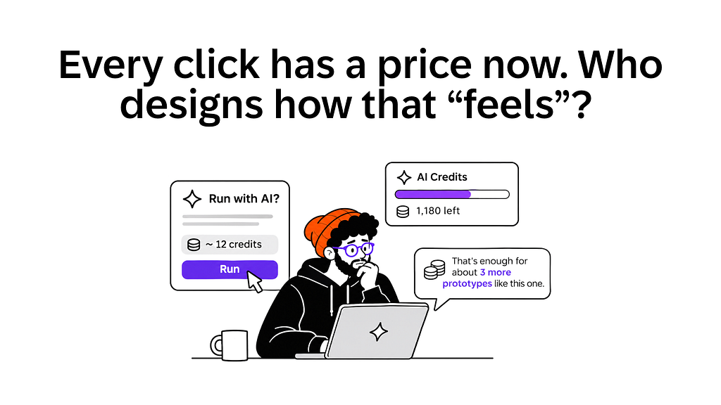
So how does that price show up on screen? A cost preview before you run a task or perhaps a credits meter in the corner? It might look like a small detail, but it can be the reason people keep using your product or move to a competitor.
Cost is a design material, like latency or error states, and it deserves the same care. Our task as designers is to make users feel in control… not like they’re watching a taxi meter run.
Budget anxiety and bill shock are UX failures
Evidence suggests AI bills are rising because we’re asking models to do much more. We use them to plan, research, write code and take complex actions on our behalf. Every step burns tokens at an unprecedented speed.
But, contrary to popular belief, tokens are getting cheaper. According to Silicon Data’s LLM Token Expenditure Index, the market was paying about $1 per million tokens in late September 2026. In May, when prices hit their highest point this year, it was around $2.
This is a phenomenon known as the Jevons paradox. When something gets cheaper to use, we find so many new uses for it that total consumption goes up.
For senior managers and executives, the end of subsidized AI plans is causing budget anxiety. If they want their teams to keep using AI tools, to work faster and to be more efficient in routine tasks, they’ll need to spend more on tokens (and maybe cut spending elsewhere).
As much as this is a challenge for business leaders, it’s also a major challenge for UX designers. For most of us, it’s the first time we need to design screens that warn users, in real time, that they’re running out of usage because of cost. Few messages feel more intrusive, or create more tension, than “Daily limit reached. Try again in 5 hours.”
Making this message sound friendlier (beware of passive-aggressiveness) is on product teams and, in particular, on designers. If users can see, step by step, what every action costs, the limit won’t feel like an ambush.

Show the price before the click
In April, GitHub announced that all Copilot plans would move to usage-based billing on June 1, 2026. Instead of counting requests, every plan would come with a monthly allowance of “AI Credits,” consumed according to the tokens each task burns. Copilot Pro+, for example, costs $39 a month and includes $39 in credits.
On paper, it sounds fair, given that you pay for what you use. In practice, though, it didn’t work out that well.
Within a day, developers were telling The Register they’d burned through a big chunk of their monthly credits in hours. One Pro+ user said two hours of work ate about 8% of their allowance. Another spent more than $6 on a single request. Many threatened to move to Anthropic, OpenAI or cheaper options like OpenRouter.
Running out of credits so fast hurt users, but for many, the worst part was not knowing the cost in advance. The cost of each request now depends on the model, the size of the request and how complex the answer is.
How do you show a price that’s so difficult to predict? Here’s a list of good practices that many organizations are implementing in their products, and that I’d call non-negotiable:
- Put the estimate next to the button. Show what an action will cost before people commit and make it visible by default. If it hides behind a setting or a tooltip, most people will never see it.
- Ask before the big ones. When a task looks expensive, or would eat most of what’s left, ask for a quick confirmation first.
- Show what each task cost. In Replit, you can hover over a usage icon in the Agent tab to see what each checkpoint cost. Users can also set spending alerts and hard budget caps.
- Warn early, so no one gets cut off mid-task. Claude Enterprise alerts admins at 75% and 90% of the spend limit, so they can raise it before anyone gets blocked in the middle of a task. Admins can also let users see their own spend and how close they are to their limit.
- Let people set their own cap. A maximum per task or per session stops an agent from burning through a month’s budget in one go.
If you’ve designed your product to follow all of the above, you’ve got the basics covered.
Thinking a bit out of the box, here’s one idea I haven’t seen in any of the AI tools I use daily. (Disclaimer: AI moves so fast that by the time you read this, someone may have shipped it).
The idea came to me while using one of my favorite AI tools: I’d love it if the tool talked in my language. At the moment, whenever I’m running out of credits, I see a message like “1,180 credits left.” Honestly, I have no idea what that means for my week. Is it a lot? Is it enough to finish what I’m working on?
As a user, I’d feel less anxious if I received a message saying, “That’s enough for about three more prototypes like this one.” It’s the same information, but because it names the type of project I’m working on, I can plan with it and know how far I can go with what’s left. The more the product learns how you work, the more accurate that estimate can be.
Not every click needs AI
So far, we’ve talked about what users see on screen. However, the biggest cost decisions are made long before that, when product teams decide which features will use AI and which won’t.
Many companies are already assessing what they get back from their AI spend. According to an EY survey published in July, 98% of senior leaders whose companies use token-based AI tools said those costs have made them reconsider their approach.
I believe design teams can build a case for company-wide AI optimization. We map out how people use a product, step by step, so we’re well positioned to spot where AI genuinely adds value and where it only burns tokens.
To do that, we can start with two practices that fit into how we already work.
First, give every AI feature a cost budget. Say your team is designing a feature that summarizes customer calls. Before building it, agree on a limit, for example, $2 per user per month. Then design around that number. If testing shows it costs $5, change the design. Maybe summaries only run for calls longer than 10 minutes, or users ask for one instead of getting it automatically. Or this feature doesn’t need AI at all.
Second, add cost to design reviews. Today, when we review a feature, we check whether it’s easy to use and accessible. With AI features, we have one more question: how much does it cost every time someone uses it? A “regenerate” button, for example, can make a single task cost several times more if users keep clicking it. Designers can’t know those numbers on their own, so engineers need to share them while the design is still under review, before the feature goes live.
As I said at the beginning of the article, cost is a design material, and design leaders should treat it like one. If we don’t, someone else will decide where AI is headed, and we’ll be left designing the “Daily limit reached” messages, with no influence whatsoever on what causes them.

Price is part of the experience
At some point in their careers, designers have had to design a feature or product with price in mind. An e-commerce site, for instance, is built around price at every step. Other examples are a pricing page or a seasonal offer you show as a pop-up on your site.
In all of these cases, users checked the price only before buying something. With AI products (especially LLMs), the price is behind every action users take inside the product. And in many cases, it stays invisible until the bill arrives, or until they run out of tokens and can’t keep working.
Designers have to decide how that price “feels,” including the friction of not being able to finish a project in one go, and having to pay more or wait a few hours to get back to it. It’s a task that comes with a lot of responsibility for us, regardless of whether tokens get cheaper.
Think back to the last time you took a taxi and kept glancing at the meter, not enjoying the city views. That’s how lots of people use AI tools today, with one eye on their credits instead of on their work. Designers can help them enjoy the ride again.
Arin Bhowmick (@arinbhowmick) is Chief Design Officer at SAP, based in San Francisco, California. The above article is personal and does not necessarily represent SAP’s positions, strategies or opinions.
Every click has a price now. Who designs how that “feels”? was originally published in UX Collective on Medium, where people are continuing the conversation by highlighting and responding to this story.