
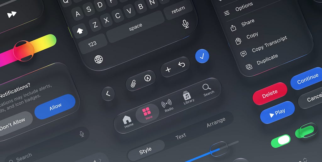
With AI, a polished look costs nothing. Native brings what can’t be drawn, and it moves with the system, one step ahead of what imitates it.

An AI assistant helped me write this. The ideas, the experience and the final edit are mine.
In June 2025, Apple introduced Liquid Glass, the new material of iOS 26. In its WWDC session on UIKit, the company put it plainly: “Your apps get this new appearance as soon as you recompile with the new SDK.” Bars, sheets, popovers and controls: most of what comes from the system frameworks changed at once, without a designer touching it.
Apps that drew their own controls got nothing. The next day, the Flutter team replied on GitHub that it was not developing Apple’s new design in its Cupertino library, the one that imitates iOS, for now. Its documentation presents drawing your own controls as a benefit: a Flutter app “looks and feels the same on all versions of the OS, even if the OS changed the implementations of its controls.” When iOS 26 shipped on September 15, 2025, that promise of stability had turned into a visible lag. The team has since moved its libraries out of the core framework to move faster, and says work is underway on Liquid Glass, but as of November 5, 2026, the issue is still open.

I worked with that choice for a long time, for the same reasons. Drawing your own controls means owning your rendering, on every version of the system. The price is that lag at every change. As long as a polished look took work, the price was worth paying: that work is what set an app apart.
AI changes the math. A polished look now takes one prompt, and generated interfaces converge in visual appearance and layout. I wrote elsewhere about why everything ends up looking alike, what people call slop; there I called apparent quality the floor, and AI now hands it to everyone. Native is a floor of another kind, the one an image doesn’t give you. Native components don’t make an app beautiful. They keep it from looking fake, and they move with the system.
AI draws the picture of native
Since October, I have been asking several AI models to design app screens, for a study I will publish soon. They imitate the system, under certain conditions, and only what can be seen.
The first condition is naming the device. Ask for a mobile app without saying which, and you get a generic screen that doesn’t really follow either iPhone or Android. Write “iPhone”, and the switches do have the shape of iOS switches. Add the instruction to follow the platform’s current conventions, and they fix a few more things that have a name: the green of the switches, the back chevron. But a year after iOS 26 shipped, the iOS they draw is still mostly the old one. The floating tab bar and the sheets detached from the edges, the iOS 26 design, only show up with that instruction, and rarely.

My explanation: an AI learns from what already exists, and the old iOS had years to fill the web. The system, meanwhile, moves every year, a little and sometimes a lot. On iOS, a native app follows by recompiling; an imitation stays stuck on the day it was copied. It’s the counterfeit copying last year’s collection, when the fashion house has already moved on to the next one.

A study published this spring points the same way. Researchers had three AI design tools generate 138 mobile screens, without mentioning iOS or Android. The models have learned “the visual syntax of contemporary mobile interfaces”, they write: navigation conventions are almost always there. But that success, in their words, “appears to be pattern-driven rather than principle-driven”, and they report a significant gap between visual and functional usability: help, error prevention and error recovery are often missing.
What the image doesn’t show
Imitating is already a lot. But the floor is mostly behavior. The back gesture that works everywhere. The share sheet everyone recognizes. The confirmation that, on iOS 26, grows out of the button that opened it. The sheet that rises from the bottom and that you dismiss with a swipe. A screenshot shows, at best, the picture of it.

Apple says it in the branding page of its guidelines: when you use components people already know, the experience feels “immediately reliable and familiar”. A familiar control does what you expect it to.
In 1998, with desktop software, John Satzinger and Lorne Olfman showed that commands that change from one application to the next make users take more actions, while a different visual appearance tends to make them more accurate. What matters is that the way you act stays the same.
It’s like the grammar of a language: everyone shares the same one, and nobody calls it slop. Slop is the stock phrase you’ve read a hundred times.
UIKit controls also come with built-in accessibility, and system components with text that scales to the size the user picked and a layout that flips for Arabic or Hebrew. On Android, the Compose documentation says that “most accessibility support is provided with little or no additional work” by its components, Material included. A control redrawn by hand has to rebuild all of that, and nothing guarantees it will: Kate Owens, at Deque, describes a custom slider that VoiceOver “skipped over entirely and never focused”.
Louie Mantia, a former Apple icon designer and a sharp critic of Liquid Glass, put it this way in 2025, about icons: “Everyone can look decent without actually being decent.” A generated mockup can draw an alert that looks like the iOS one without saying that the iOS one should be used. Rebuilt by hand, however faithfully, it only gives the app the picture of the floor.
The more apps get built from generated mockups, the more of them will look native without being native. That’s why, in my view, native matters more today than it did yesterday. The risk lies in the copied mockup: when an AI writes the code of a native project, it can call the real components. It can also produce native slop: the real components, all left at their defaults, and nothing of the brand around them. It works and it follows the system, but it looks like every other app.
On iPhone, the difference shows
You might think users see none of this. The only controlled experiment I found that pits a native app against its cross-platform version says they do see a difference, on iPhone, as soon as they can compare.
In 2014, Esteban Angulo and Xavier Ferré had thirty-seven people test two versions of the same app, fourteen of them on iPhone. One was native, the other built with Titanium, a cross-platform tool. Asked which version best matched their idea of an app for their phone, iPhone users picked the native one 86% to 7%. On Android, the gap was much smaller: 52% to 39%.
On iPhone, the seven people who had tried the cross-platform version first found it typical of iOS; among the seven who tried it after the native one, only four did. The gap mostly shows by comparison. But the cross-platform version also displayed native components, and a different team had designed it: the study can’t tell what made the difference. Nor does it say what it’s worth in ratings or sales, and a study of nearly 12,000 Android apps concludes that native and hybrid apps (web apps in a native shell) do equally well in ratings.
The ceiling is elsewhere
Native fixes the fake, not the alike. Standing out from other apps is still the brand’s job, and the floor doesn’t prevent it. In 2019, on UX Collective, Reza Bigdeli, an Android developer, answered designers who find standard components “cheap”. His advice: follow the platform’s guidelines, and keep creativity for the web. I follow him on the floor; for the rest, an app can have a strong identity without leaving its platform’s conventions.
Apple itself doesn’t reward a single style. In 2023, its Design Awards honored Flighty and Duolingo the same year. Flighty won in the Interaction category, which rewards interfaces “perfectly tailored to their platform”. Its founder, Ryan Jones, wanted the app to work so well that it would feel “almost boringly obvious”. Duolingo, on the other hand, is a highly stylized interface, which Apple still praises for its “best-in-class design” and “easy-to-follow UI”.

For Apple, “even a highly stylized interface can be approachable if it maintains familiar behaviors and patterns.” A WWDC26 session describes an app in two layers: bars and controls rely on what people already know, the content carries the brand, and the whole rests on a “baseline of platform familiarity”. That boundary is what a generated mockup doesn’t show.
Where to spend the effort
What comes from the system: navigation, back, sharing, confirmations, sheets, controls, text size. You don’t redraw them by default: Apple advises keeping custom work for the places where it has the “biggest impact”, and warns that a utility control remade by hand can make an app look less native, or even dated. Specify them by name, so nobody rebuilds them as a picture.
What comes from the brand: the content, the typography of headings (which should also follow the size the user picked), illustration, the tone of the copy, the moments where the app surprises. That’s where the identity budget gets spent. Apple even warns against too much brand: a brand color used everywhere dilutes its impact.
When the mockup comes from an AI, name the device and its current conventions in the prompt, then review that split first. Anything that looks like a system control should at least behave like one, and the safest bet is that it is one. The rest can be as free as you like: that’s where an app stops looking like the others.
Cover image: Apple’s design kits for iOS 27, the system components every app gets. Image: Apple Developer.
Mathieu Poli is Head of Frontend Engineering at GoodBarber and writes about frontend engineering, product design and AI.
Native is a floor, not a ceiling was originally published in UX Collective on Medium, where people are continuing the conversation by highlighting and responding to this story.