

The retention killer that never shows up in a requirements doc.

The room was in Seoul, quiet except for the hum of the air conditioner. Behind the one-way mirror, product planners sat with notebooks, in the years before K-beauty shook the world. Then one sentence broke the silence.
“If my boyfriend gives me this brand as a gift, that’s his way of telling me he wants to break up.”
Every participant in the room nodded, as if on cue. The second sentence hit even harder.
“The lipstick has incredible color payoff. But I take just the product out and transfer it into a Chanel case before I carry it.”
Lipstick is the one cosmetic that lives in public view. Its case isn’t packaging. It’s an accessory, in the same category as a watch or a wallet. A Chanel case was the smallest unit of luxury she could actually own, and the cheapest tool available for defending her identity in front of other people. She hadn’t rejected the product: she loved the color payoff and used it every day. What she rejected was the signal the brand sent to everyone watching. With her own hands, she’d taken a knife to it and cut function clean away from identity.
Fabricio Teixeira has made a related point about out-of-box experience: what happens after purchase is still part of the product experience, and physical touchpoints continue carrying the brand story. MISSHA showed what happens when that story clashes with the user’s own identity.
Translate that into product terms: core feature satisfaction, off the charts. Repurchase and referral intent, on the floor. Run the usability tests, mine the open-ended NPS responses, and the reason never surfaces. It’s the wall every planner eventually hits, staring at a requirements doc that has nothing wrong with it.
Same spec sheet, completely different retention.
MISSHA opened the “roadshop” category at a startling $3 a product, and grew from a single Korean brand into one now sold across more than 40 countries. LANEIGE sat in the same affordable range, but it occupied a completely different place in consumers’ minds. An Amorepacific brand now sold through Sephora in more than twenty countries, it was never expensive, but never embarrassing to pull out in public either.
The price gap between the two brands was negligible, and their ingredient lists were close enough that no spec comparison would explain the difference. Then latecomers arrived at the same price point and layered on identity. One built a store experience like a princess’s dressing room; another filled every touchpoint with a consistent nature-first message. That’s where the crack started.
The question in every product review meeting was always the same: “What feature do we add to lift retention?” The question itself was wrong. The spec deck, packed card after card, was missing nothing. The requirements doc, by design, was never built to hold the axis of “how do I look to other people, using this?”
Why identity feedback never makes it into a spec.
The raw voices from the repositioning research didn’t pull punches.
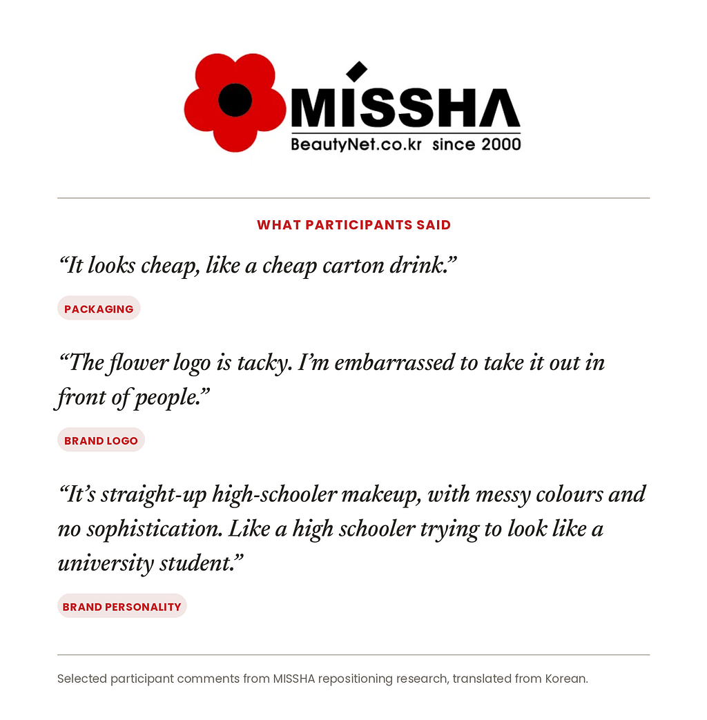
Hearing “tacky” and “embarrassing” puts a planner in a bind. A usability problem, like “I can’t find the button,” has a clear owner and a clear fix. An identity problem has no owner. It’s scattered across the logo, the copy, the tone of voice, and the store lighting. It’s impossible to cut into a single Scrum ticket.
Then came the sentence that flipped the table.
“Among affordable brands, Laneige is one I can take out in front of my boyfriend without embarrassment, but MISSHA is not.”
No standard benchmarking data, no quantitative metric, will ever catch that gap. Delivering “this looks tacky” straight to the executives who built the brand made for a silent debrief room. But the project succeeded for one reason: feedback nobody could quantify still got put at the top of the roadmap, instead of filed away in an appendix. The harder step was organizational: leadership chose not to defend the brand against the research. They treated the discomfort as evidence to work with, rather than something to explain away.
Launched in 2000, MISSHA was one of Korea’s original affordable beauty pioneers, helping establish the one-brand-shop model that became a defining part of early K-beauty.
The axis missing from the priority matrix.
One useful way to translate Jennifer Aaker’s brand-personality theory into UX terms is to think about two axes at once.
The function axis: does this solve my problem?
The identity axis: what does using this say about me to other people?
The identity mismatch can run in two directions: who users believe they are and who they want to become. MISSHA fit neither. In those sessions, it represented a version of the self they were trying to leave behind.
The requirements docs, feature specs, and competitive matrices we write cover almost only the first axis. The second gets waved off with “brand or design will handle it.”
But the real switch that flips churn is the second axis. Function can be excellent, and if the identity score is low, users hide the product: no screenshots, no mentions on social, quietly buried two pages deep in a home-screen folder. When the identity axis is strong, users will happily tolerate real functional flaws.
This pattern is playing out right now. A KPMG and University of Melbourne study of 48,000 respondents across 47 countries found that 57% of employees admit to hiding their AI use at work. In a controlled Atlassian experiment, identical work was rated far lazier the moment it was disclosed as AI-assisted. High satisfaction and concealed usage: the same structure as a lipstick moved into a Chanel case.
How a single raw sentence rewrote the roadmap.
MISSHA’s recovery started right there. The repositioning concept, “Bold Beauty,” came straight out of those sessions, and every touchpoint was rebuilt around a single ideal-user image: a confident career woman living on her own terms. Trace any decision back far enough and it lands on a sentence a consumer actually said out loud. Not a metric. A sentence was the basis for the roadmap.
3 actionable steps for your next sprint
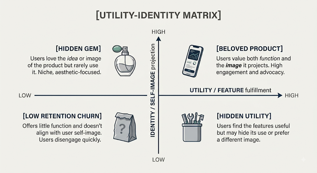
- Add an identity axis to the priority matrix. Next to the impact-effort matrix, ask one more question: does this feature reinforce the user’s ideal self-image? Nielsen Norman Group’s State of UX 2026 makes a related point: as design systems and standardization make competent UI easier to produce, surface-level interface quality is becoming less of a differentiator. That makes the identity axis harder to dismiss as “just branding.”
- Add “did you hide it?” to your churn interviews. “Why did you stop using this?” only returns predictable feature complaints. Add: “Have you ever told a coworker or friend you use this app?” and “Have you ever screenshotted this screen to share it with someone?” If usability is fine but people are reluctant to show it off, that service is quietly sitting on a time bomb.
- Put unquantified sentences on the roadmap agenda. We’re in an era where AI summarizes thousands of VOC entries in seconds. But Nielsen Norman Group’s research on AI-generated review summaries found that even well-designed summaries fail to answer the specific question a user actually cared about — customers kept clicking back to individual reviews to find the exact detail the summary had smoothed over. A sentence like “I’m embarrassed to use this in front of my boyfriend” gets reduced, in the summary, to a flat line like “brand image needs improvement.” What flips the table isn’t a summarized chart. It’s a user’s raw sentence.
Closing
Identity isn’t an extra line item to hand off to the brand team. It has to come into the product document as its own axis. Leave it out, and even the most polished feature eventually becomes replaceable.
Picture the product you’re building right now. Does the user proudly pull it up in public, or quietly bury it two pages deep in a folder?
This article draws on consumer research the author advised on during a Korean beauty brand’s revitalization project, and reflects participant perceptions within a specific research context and point in time.
Dr. Park uncover unspoken consumer needs and turn them into new product concepts, brand strategies, and market opportunities.
The feature was fine. So why did users keep hiding it? was originally published in UX Collective on Medium, where people are continuing the conversation by highlighting and responding to this story.