
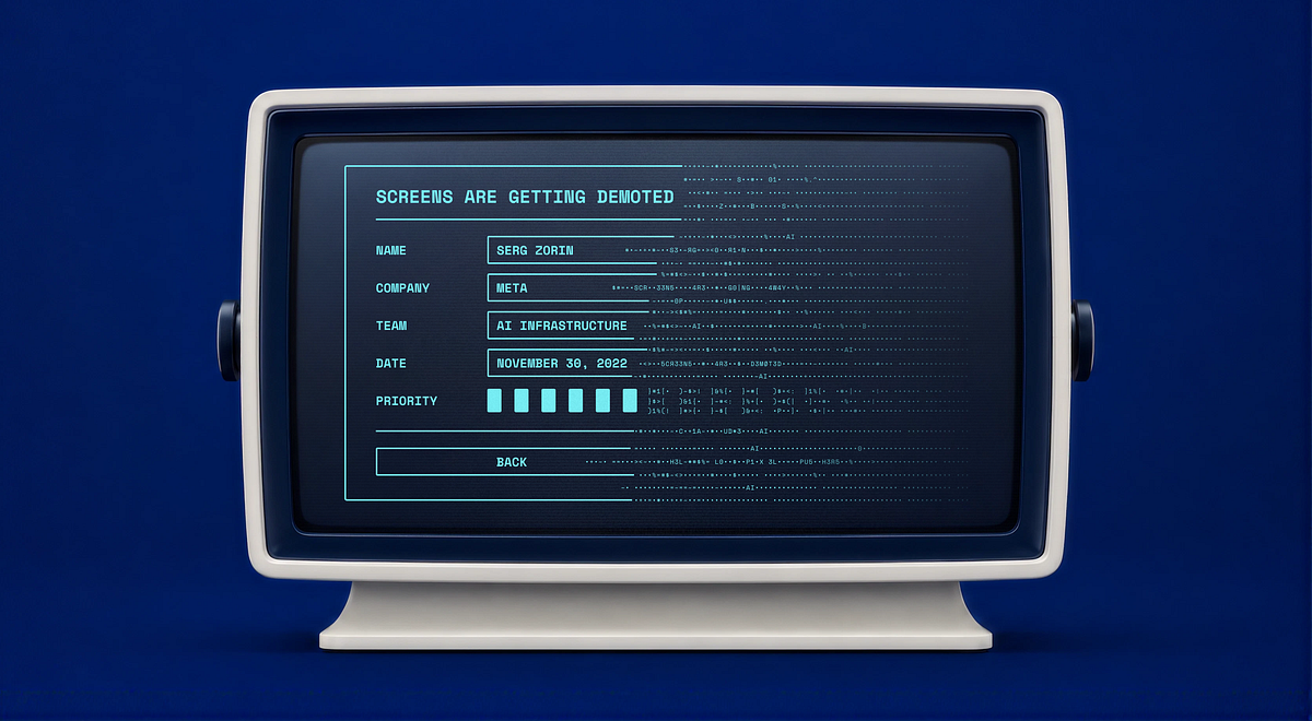
Designers often say that UX isn’t really about screens. It’s a line I see in portfolios, I hear in interviews; that’s the line we use to signal that we’re thinking beyond just pixels. But honestly, for most of my career, that wasn’t true. In one way or another, the job was screens: building flows in Figma, mapping out states, writing specs, worrying about happy paths and edge cases, and handling handoff. We kept saying UX isn’t about screens, even as we kept making more of them.
Well, AI is about to call the bluff.
Here’s a simple example. Let’s say you took a selfie with your friend Mark last week, and now you want to send it to him.
Open the mail app. Tap compose. Type the name. Hit Attach, and you’ve left the mail app entirely. You’re in the file/photo picker now, a separate product with its own rules. Dig around. Recents. Last week. There. Tap. Back to compose. Check the attachment. Send.
Compose, attach, browse, select, confirm, send. That’s six small steps just to move one photo, and each one was extra work around the real goal, not the goal itself.
Now, you just say or type: send Mark the photo of us at the game from last week. That’s it.
The same happened to reading design articles. You don’t need to read it all to decide whether it’s good. Paste it into Claude, ChatGPT, or whichever AI tool you use and ask whether it’s worth reading. Hopefully it will say: “Yes, this article is the best article about the impact of AI on UX.” Though I still encourage you to read it and make your own judgment.
What matters here is how the work has changed. Now, the system finds the photo, figures out who Mark is, attaches it, writes a reasonable message, and sends it. All those old steps still happen, but you’re no longer the one clicking through them.
A lot of UI lies in the gap between what you want and what the system forces you to do by hand. That gap is closing fast.
This was most of the job
I work at Meta in the AI space and design products where complexity is real, and so is the learning curve. If I’m being very honest about where my hours went, a lot of them went into screens that only existed because the software couldn’t act on what someone wanted.
For example, the config page was there because the system couldn’t guess the right setting, so we ended up with forty fields. Nobody ever woke up excited to fill out forty fields. We tried to make it better with onboarding wizards, but in the end, it was still forty fields.
The setup wizard was needed because the system couldn’t figure out what you needed, so we guided you through it one question at a time.
The dashboard was there because we couldn’t be sure what really mattered to users, so we put twenty metrics on one screen, added tables for people to check themselves, and hoped you’d find the one that mattered. A lot of dashboards are just us admitting, “We’re not sure what’s wrong either. Maybe you can tell us.”
But none of that was the real goal. People using serious products didn’t want the screens. They wanted the results hidden inside them. We built screens because it was the only way to deliver those results, and for a long time, there really was no other option.
Now, there’s another way: AI. This changes what most designers do. The question shifts from “How well can you design these screens?” to “Should these screens exist at all?”
This idea isn’t even new. About ten years ago, Golden Krishna wrote The Best Interface Is No Interface, saying that designers often reach for a screen by habit when the better answer is sometimes no screen at all. He was right, just a bit early, because the technology wasn’t there yet. Now it is.
Jessa Parette argued something similar in “AI just called design’s bluff”: that a decade of design work was interface production, and AI has taken the cover off. My question is which screens are left standing.
Why complex systems feel it first
I see this most clearly in complex tools, because that’s where I spend my time.
People often say that power users love complex interfaces. In reality, they just put up with them, and they memorized your product because the results were worth it, not because the process was great. These users already knew what they wanted and what the outcome should be. Everything in between was just extra work: navigating, configuring, clicking through five tabs to do one thing. It was necessary for a long time, but it was still extra work.
But now, user habits have changed. A few years ago, when we did walkthroughs, stuck users would always ask, “Which screen do I open for this?” These days, someone will interrupt and ask, “Is there a Claude skill to do this?” At first, it sounds odd. After you hear it ten times, it starts to feel normal.
People aren’t asking where to find a screen anymore. Instead, they want to know if there’s a skill or agent that can take their intent and give them the result without using the UI.
More and more, the answer is yes.