
AI made quality available to everyone, and made it average. What sets work apart now is a decision you can see.

An AI assistant helped me write this. The ideas, the data and the final edit are mine.
E.PIANO 1
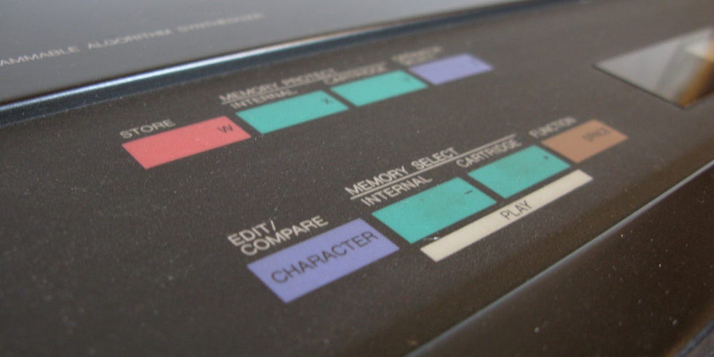
In 1983, Yamaha released the DX7, the first digital synthesizer to sell in large numbers. It was powerful and almost impossible to program: no knobs to shape the sound, only menus on a small display that few musicians ever learned to navigate. So it shipped with factory sounds, 128 presets that two specialists had put together in less than four days. Most owners never went further.

One of those sounds, “E.PIANO 1”, imitates an electric piano. It sounds professional from the first note. The music theorist Megan Lavengood counted how often it shows up on the charts: in 1986, it is on 39% of the Billboard Hot 100 number ones, 40% of the country number ones and 61% of the R&B number ones. Her study is called “What makes it sound ‘80s?”: a quality sound handed to everyone became the signature of a decade, and then the surest way to date a record.
The same year, Brian Eno released Apollo with Daniel Lanois and his brother Roger, an ambient album written for a documentary about the Moon missions, and he used the DX7 on it. He was one of the few people who could program the machine in depth. Yet his case reads as a matter of order more than technique: music imagined for those images first, then the sounds to make it, which no preset contained.
The 2026 preset
Generative AI is doing to design what the DX7 did to sound. It gives a clean result to someone who doesn’t know how to adjust the tool, and that result converges.
I measured it on twelve app briefs, with seven models from three makers (results and public benchmark). For a corporate law firm, all seven pick navy blue with a touch of gold. The average gap between their colours is only 9, the same as for a funeral home, measured in ΔE, the distance between two colours as the eye perceives it: under 10, they are shades of the same colour. The category sets the look.


Prose is going the same way. In a 2024 study published in Science Advances, Anil Doshi and Oliver Hauser had people write short stories with or without ideas from a language model. With the help, stories were rated more creative and better written, especially among the less confident writers. They were also more similar to one another, what researchers call homogenization. In another field, selection decisions such as hiring, the computer scientists Jon Kleinberg and Manish Raghavan described a related effect in 2021, algorithmic monoculture: when everyone relies on the same algorithm, each of them can come out ahead while the group as a whole does worse.
The DX7 preset had at least been chosen, once, by two people, for no song in particular. The AI’s preset was chosen by nobody: it’s an average. What you recognize in a screen or a paragraph that looks AI-made is something nobody chose.
The preset looks good
Presets didn’t wait for models. In 2013, Paul Adams, then VP of Product at Intercom, was already warning against the Dribbblisation of design: interfaces polished for the shot rather than for the problem.
What’s new is elsewhere. For a long time, the preset showed: a template looked like a template, and moving away from it bought visible quality. The 2026 preset shows much less. It is coherent and polished on the surface, sometimes more finished than what a small team in a hurry would have shipped. As Tanya Donska put it in Built In: “All of it is correct. All of it could belong to anything.” Not all of it is correct, though: in the same measurement, 34 primary colours out of 84 fail the minimum contrast for white text on top, which you only see once you check.

So apparent quality has become the floor. Much of the value people saw in designers came from the gap between ordinary work and careful work, and the machine now closes that gap on demand. Whatever sets work apart has moved somewhere else.
Three ways out, and only one holds
The first idea is to do better than the machine. Two things need separating here. Fixing what it gets wrong, like that contrast, is still essential, but it’s verification: an audit tool flags it just as well, and it sets no one apart. What holds up badly is the race for finish, because the floor rises with every new model and this year’s extra polish will be next year’s average.
The second is to be original. It doesn’t hold up either, and the same data shows why. I asked the same models to avoid clichés. They did drop Playfair Display and Bebas Neue, but two-thirds of their new headings landed on a new repertoire, with Fraunces 19 times out of 84 and Space Grotesk 15 times. Originality pursued as a goal ends up averaged in turn, just a little later.

That leaves decisions. A decision differs from an instruction by its content: “avoid clichés” says nothing about the product, while a decision starts from what this particular product has, which the average doesn’t know. And it has to be held. The boxing gym brief said “a boxing gym in a working-class neighbourhood of Marseille, members are mostly young adults who train hard.” The seven models still returned roughly the same thing: bright red or orange on a near-black background, with condensed headings for six of them. To describe the mood they were going for, they chose words like “raw, intense, gritty”, with no trace of Marseille or of the neighbourhood, as if the category had covered up the context in the brief. Deciding, then, means defending what’s particular against the pull of the category, at every step where the preset comes back.

“It looks AI”
This changes the design review. “It looks AI” has become a common remark, about a mockup as much as a text. It sounds like a comment on quality, and it often works as an accusation.

Yet the look it points to doesn’t prove that a machine was involved. A person following the defaults produces the same thing, and a model given real decisions, a colour with its reason or a constraint specific to the product, can move away from it. The look only proves that the preset stayed. Treating it as evidence turns the review into a trial: people ask who made the screen, and nobody discusses what it should be.
The remark has a useful version, which is to name the preset. Maya Brennan’s guide to de-slopifying designs is a good list of what to name.
This gradient came with the tool: what should our colour say here? This card grid is the standard layout: what does this content actually need? Put that way, the question asks for a decision, and it applies just as much to a screen drawn by hand. As hipuku writes, with generative tools “the first version turns up before the opinion has formed”. Naming the preset reopens that frame.
For a team, that comes down to two habits. In review, ask what came from the preset before judging whether it works. In the design system, write the reason for each choice next to its value. An entry that reads “primary colour: #1B2A4A” says nothing more than the preset. “Primary colour: the blue of the firm’s original sign, darkened to hold contrast” shows a decision, and gives the next person a reason to keep it or change it.

A common objection is that you just need to give the AI a design system. That is indeed the right answer, as long as someone has made the decisions it contains.
The question to keep
E.PIANO 1 sounded great in 1986, which is exactly why it ended up everywhere, before it dated every record that kept it as it was. The 2026 look will probably go the same way. The preset was never a quality problem, and once quality is a given, only one question is left to ask in front of a screen: did someone decide this?
Cover photo: Leo-setä, via Wikimedia Commons (CC BY 2.0), cropped.

Mathieu Poli is Head of Frontend Engineering at GoodBarber and writes about frontend engineering, product design and AI.
The synth everyone owned and few could program: a lesson for AI design was originally published in UX Collective on Medium, where people are continuing the conversation by highlighting and responding to this story.