
On the value of cultural references, and the cost of losing them at scale.

A designer is not an artist. A designer is a commercial problem-solver, hired to take a client’s half-formed intent — a vibe, a feeling, a vague sense of “make it look professional” — and give it form. That is the job whether the tool is a pencil, Photoshop, or a prompt box. AI has not changed what a designer does. It has changed who can now attempt to do it themselves.
“Who can now attempt it” is not one group, though. It’s three, and the current debate around AI usage is weaker for not differentiating between the different needs of these groups.
Together, I’ll call them ‘the designless’: not a single condition, but an absence of design in three different ways — lacking the access to hire it, the awareness to know what to ask for, or the motivation to bother when the means are already there.
Let’s define these groups:
The Vernacular: someone whose need is met by a form that already exists, and whose amateur execution isn’t a defect but the message itself. A lost-cat poster — marker on printer paper, a slightly blurry photo, tear-off phone-number strips — reads as urgent and real precisely because it looks handmade. Nobody could have faked the panic of a missing pet convincingly enough to bother; the roughness is itself the evidence. Hand this brief to an AI model and the danger isn’t blandness for its own sake, it’s that a polished, professionally typeset lost-cat poster reads as staged. That polish actively undercuts the one thing the poster needed to do, which was to be believed. The public would be right not to trust it. This group has little need for AI design solutions.
The Referenceless: someone with a real communicative need and no cultural vocabulary to meet it, and often no means to close that gap by hiring someone who does. The two shortfalls tend to travel together, though not always: sometimes it’s a lack of exposure rather than a lack of money, sometimes both at once. Either way, they don’t know what a good result looks like, so they can’t ask for one, and they can’t tell good from bad once they’ve got it. The host of a local book club typing “Make me a poster for a coffee and book discussion group” into a box and taking the first thing it gives back.
The Corner-Cutter: a business with real revenue and real marketing spend, fully able to commission the work, that simply doesn’t. This isn’t a literacy problem. They know what good looks like. They’re choosing not to pay for it.
Collapsing these into a single “designless” category, then arguing about whether AI helps or harms them, is why the discourse keeps arriving at the same two dead ends: AI is either a great leveller or a plague of slop. Neither is right, because neither question is actually about the same person. For the Vernacular, AI is often actively the wrong tool, not a neutral one — it can replace something trustworthy with something that only looks better. For the Corner-Cutter, AI didn’t create the problem — the problem is not paying for a photograph of a real burger for their menu, and AI is just a new means to skip that. It’s only for the Referenceless that AI is doing something genuinely new: handing a powerful tool to someone with a real need and no map for using it well. And for them, what decides the result isn’t the tool. It’s how much cultural literacy the person holding it brings to the prompt and their assessment of the output.
The backlash
The backlash against AI design has been loud this year, and in places physical. It picked up a nickname, the “ChatGPT flyer pandemic”, after ads for surf lessons, local gigs, and takeout spots began blurring into one recognisable house style: the gradient, the over-rendered brush script, the lack of white space.

An AI-generated menu display in San Francisco was tagged with graffiti. People have started to deface AI posters with anti ‘AI Slop’ stickers. Small businesses have leaned into the opposite aesthetic on purpose, posting hand-drawn cardboard signs reading we will not be using AI flyers to promote ourselves.


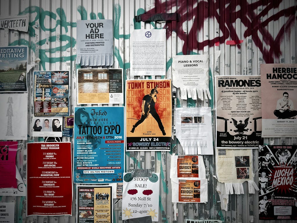
But “I’d rather see a hand-drawn sign than AI slop” assumes the alternative to AI slop was always warmth and craft. For many small businesses, it wasn’t. Long before generative AI, shop windows were full of posters made in Microsoft Word: an oversized headline, Comic Sans, clip art, run off at the local copy shop. Nobody vandalised those. For most of these businesses (the Referenceless, not the Corner-Cutters) the honest alternative to AI slop was that Word poster. Or nothing at all.
Someone applying knowledge on your behalf
Since 2023, the Brooklyn designer Max Kolomatsky has roamed New York picking up amateur flyers taped to lampposts and shop windows, a dog walker’s ad, a hand-drawn sign for a cleaning service, redesigning them for free, and then stealthily putting his new version back up. No one asked him to.
One redesign took on a flyer for a handyman service, a case where the two gaps overlap. He was Referenceless, with no vocabulary for what a good sign needed to say first. But he was also working without the means to close that gap any other way: cards were the only material he had, so a bigger sign meant more of them, taped together, rather than a rethink. For someone in this position, an AI tool costing nothing and asking nothing of them in return isn’t a downgrade from hiring a designer — it’s the first time either option was ever really on the table. Kolomatsky condensed the flyer to what mattered, added colour and a single clear illustration, and replaced the scattered fragments nobody on the street was going to stop and piece together. The handyman never asked, and likely never found out who did it.

No AI anywhere in that story. The gap between an amateur flyer and a good one is not money. It is someone applying design knowledge on the amateur’s behalf, the thing the Referenceless lack, supplied for free, by hand, once.
I have done a smaller version of the same thing. In 2013 I passed a man on London Bridge holding a handmade sign asking for work: Richard, an IT manager made redundant after the 2008 financial crisis. I was taken aback by this well-dressed, white-collar worker resorting to a homemade sign. He was entrepreneurial and resourceful, but working from a template of what a sign should say rather than any sense of what would actually stop someone walking past. His sign was crudely printed from Word and taped together from printer paper, with no sense of what mattered first. I reordered his content: his name being the most vital to humanise his situation, then what he did, what he wanted, how to reach him. Printed in a striking red, clear type. My studio was just around the corner; I spun up an alternative, printed and mounted it, and had it back in his hands twenty minutes later.

The work was not imposing “good design” over what he had made. It was translation, taking what he clearly meant and giving it a form that said it more clearly. Neither Kolomatsky nor I did this at scale, and neither of us could have. That’s the gap AI can actually fill for the Referenceless, not by replacing this kind of judgment, but by reaching the people no designer, paid or volunteer, was ever going to walk past.
Where translation goes wrong
Not every amateur artefact is waiting to be translated. This is the Vernacular’s dilemma in miniature: a lost-cat poster has its own vernacular, and everyone reads it instantly — marker on printer paper, a slightly blurry photo, tear-off phone-number strips along the bottom. That roughness is not a failure of design; it carries implicit messages of urgency, of being unpolished, of being human. A version that looked too composed, too art-directed, would undercut it, making the loss feel staged rather than real.

More references is not the same as better. The reference that matters for a lost cat is the lost-cat poster itself. A designer who reaches instead for Swiss grids and a considered palette has not raised the floor — they have swapped one set of references for a more prestigious set that communicates worse. The same logic explains why some communities push back on having their signage cleaned up at all.
Three tools, one principle
My own references started early, and by accident. In the 1980s, before home computers and desktop publishing put type in reach of anyone, my mother made posters for her choir using Letraset, sheets of rub-down lettering, transferred one character at a time, out of a drawer we kept permanently stocked. It was the only way to get real typography onto a page at home. She taught me as a child to plan lettering before laying down a single letter: spacing, line breaks, where to start a word so it wouldn’t run off the edge. Letraset punished you for not planning. Once a letter was down, it was down.

Desktop publishing and home printers removed that penalty and lowered the baseline for what counted as good enough, making passable posters achievable without any of that planning. AI is lowering it again, faster and further, and for the Referenceless, further than it has ever gone, because for the first time the tool can supply the references as well as the execution. Across all three tools, knowing how to plan a poster produces a better poster than not knowing.
The same tool, twice
Take a poster for a small farmers’ market, about as generic a brief as exists. I gave mine a place: Notting Hill.
A single-line prompt, “poster for a farmers’ market in Notting Hill”, returns what you’d expect: an over-saturated illustration of produce, a rounded sans-serif, a generic illustration of a street. This is the Referenceless prompt exactly as they’d type it, and for some it may be a passable attempt. But the general public is increasingly aware of those telltale fingerprints AI leaves on its outputs.

Write the same brief with something to draw on and the prompt grows longer and more specific, built from named references rather than gestured-at vibes. As an example, I decided to reference Edward McKnight Kauffer, the poster designer behind much of the best British commercial art of the 1920s and 30s, for London Transport, Shell and the Empire Marketing Board, flattened planes of colour, confident geometry, illustration doing the work rather than photography. That era of British poster design may now be viewed with fresh eyes while also still capturing a vague sense of warm nostalgia that people might seek from a farmers’ market. With some visual references and description, an AI model can be steered into more refined outcomes.

What comes back belongs to a place and a season, not to the median of a training set. Neither poster required hiring a designer, a stall-owner running a farmers’ market stand was never going to commission one either way. Only one required knowing anything about design. The tool did not change. The person operating it did. This is not to say the more referenced output is “good,” but it is at the very least culturally relevant to a location, and differentiated from the baseline, generic output.

The flourish
The same thing happens at the level of a single ornament. AI keeps scattering small hand-drawn emphasis lines across posters, the swashes and flourishes under a headline that read, to most people, as an unmistakable AI tell.

The model did not invent them. They come from traditional sign painting, and they do belong on a poster. The model simply applies them without understanding where they came from, scattering them across a ‘Summer Sale, 25% off’ sandwich board where a real sign painter never would.
Point the model at an actual reference, the sign painting of someone like Ches Perry, or classic hand-lettered supermarket signage, and the identical ornament that reads as slop in one context reads as craft in the other.

Same visual vocabulary, same model. The only variable is whether the person prompting knew where the text emphasis ornaments came from.

These habits are becoming legible to people well outside the industry. Passersby who would never have clocked a sign-painting flourish now spot it on every AI poster in the neighbourhood, because the model reaches for it without any sense of when it is earned.
For the Referenceless, a reference-led use of AI is a real improvement on the Word poster, or on nothing — the two alternatives actually in front of them. No designer was displaced. Nobody was owed one.
When designless isn’t the honest description
None of this extends to the Corner-Cutter, a business that already has the means to do better.
The clearest case is the AI-generated food “photography” spreading across café and restaurant menu boards. A business with real revenue and an actual product, fully able to commission a photograph, instead generates an image of a burger, or a bowl, or a plate that was never plated, lit, or served by anyone.

There is a clear distinction from the ways a business may have cut corners previously. A café using a stock photo of someone else’s burger is lazy and a little dishonest, but the stock photo depicts a real burger, cooked and plated by a real person somewhere, even if it was never yours. The AI version is a statistical average of burger images, rendered to resemble a photograph of something that was never assembled anywhere at all. It borrows the visual grammar of proof with no claim to it.
Customers read this faster than the industry assumes. On a video about AI menu photography, designer Kenzi Green quoted comments from followers making the same connection: ‘cut corners on the marketing, and people assume you’re cutting corners on the food too.’
Being Referenceless has nothing to do with any of this. The Corner-Cutter isn’t confused about what good looks like, and no reference library fixes a choice. This is an old bad habit, made worse, in new tools.
The wallpaper, and the world it makes
One person prompting without references produces one placeless poster. A model shipped with defaults produces the placeless default everywhere at once, because nearly all of these tools come out of the same handful of dominant tech companies and frontier labs, shipping globally with the same aesthetic settings baked in.

The flyer in Lisbon, the menu board in Osaka, the community-hall poster in Notting Hill: run through the same defaults, they start to look like they came from nowhere in particular. Nobody set out for that outcome — it’s just what happens if the defaults stay defaults.
The Corner-Cutter isn’t a design problem, and AI didn’t create it. Skipping a real photograph of a real burger was already dishonest before generative tools existed; AI just made it cheaper. No amount of better defaults changes a choice not to pay for the truth — that’s a labelling and disclosure question, not a design one.
The Vernacular needs protecting from AI. A lost-cat poster does its job by looking handmade; a model’s job here is to recognise the brief and decline to polish it.
Only the Referenceless get something genuinely new from AI, and only because hiring a designer was never realistically on the table for them — sometimes for lack of vocabulary, sometimes for lack of budget, usually both. Where hiring genuinely is within reach, a person still beats a reference-fed model, for the same reason Kolomatsky’s redesigns worked: someone applying judgment on another person’s behalf, not a system applying a pattern. That judgment was simply never coming for most of the Referenceless, which is why AI has real work to do here specifically.
The Kauffer-referenced farmers’ market poster and the generic one came from the same model, with the same effort from the user. The only difference was that one prompt carried named references and the other didn’t, a gap in what the tool asks for, not in the technology itself.
The answer then, is better interrogation of the brief: a few questions any of these three groups could answer without any design vocabulary at all. A postcode. A decade. An occasion. A comparable. Route the prompt through a curated, licensed library of regional and historical visual reference — the equivalent of handing every farmers’ market prompter a copy of E. McKnight Kauffer or Abram Games’s posters before they ever hit generate — and the model does the cultural work the Referenceless user was never going to pay a person to do, without asking them to become a designer first and with less risk of eroding the local visual culture.
That library is buildable today. It isn’t a research problem. The question we should be asking ourselves is not just ‘does it look good?’ but ‘does it look like it came from somewhere?’
More from UX Collective on this topic
- The real reason everyone hates the viral AI food slop
- AI made everyone a creator, not a designer
- Is AI slop training us to be better critical thinkers?
For the Designless was originally published in UX Collective on Medium, where people are continuing the conversation by highlighting and responding to this story.